Any large language model can write a clean SQL query today. Ask it to pull daily active wallets for a protocol, and it’ll hand back a correct answer in seconds. That was the differentiator a
Any large language model can write a clean SQL query today.
Ask it to pull daily active wallets for a protocol, and it’ll hand back a correct answer in seconds.
That was the differentiator a few years ago.
It isn’t anymore and treating it as the job is how a lot of people are going to get replaced by the exact tool they thought they were learning to use.

What a model can’t do is sit with that number and decide whether it’s real.☞ It can’t tell you why a protocol’s TVL looks healthy on a dashboard and hollow underneath it. ☞ It can’t feel the difference between a genuine user and five wallets controlled by the same person farming an airdrop. ☞ It can’t sit across from a founder who says “we’re bleeding liquidity” and turn that sentence into an actual diagnosis.
Deciding what a number means, and what to do about it, is the job now. Everything else is what turns your judgment into something someone will actually pay for.
The actual shape of the work backs this up, and it looks nothing like the tool list on a job posting. Something like a fifth of it is writing queries and building dashboards.
The rest, the majority of it, is talking to the people closest to a problem to find out what they actually need, which is rarely what they asked for first, cleaning data that was never built to be clean, checking whether a number that looks fine on a chart actually matches what’s happening inside the protocol, and packaging what’s found so someone can act on it.
And crypto makes this skill unusually important.
Almost every other industry keeps its internal numbers private, so you’re stuck trusting whatever a company chooses to disclose.
On-chain, the raw data is public. But public doesn’t mean honest. A number can be technically accurate and still be meaningless, or worse, deliberately misleading, and the only way to tell the difference is understanding where that number actually came from and whether it lines up with what’s really happening to the protocol behind it.
That’s what it means to think like a Web3 analyst: -> not running queries faster than everyone else, -> not writing SQL a model can already write just as well, but understanding the life cycle a number travels through before it reaches a dashboard and knowing which of the metrics that actually matter are worth trusting at each stage.
That’s what this piece covers: the full on-chain data life cycle, from raw transaction to decision, and the specific KPIs that separate real signal from manufactured noise.
Part One: The Mental Shift
Most people who call themselves crypto analysts are dashboard readers.
They can tell you a protocol’s TVL, its daily active users, its trading volume. What they usually can’t tell you is whether any of those numbers would survive a closer look.
An actual analyst asks three questions of every metric before trusting it:
Who benefits from this number looking good? Every metric in crypto is published by someone with an incentive. A protocol’s own dashboard, a token’s own foundation, an ecosystem’s own grant program, all of them have a reason to want their numbers to look larger and healthier than they are. That doesn’t make the number false. It means the number deserves scrutiny proportional to how much someone benefits from you not scrutinizing it.
Can this number be manufactured cheaply? Some metrics are expensive to fake. Others cost almost nothing. A wallet address is free to create. A transaction that costs a few cents in gas can register as a “user.” If a metric can be generated at near-zero cost by someone with a reason to inflate it, assume some portion of it has been.
What’s the number not telling you? A single aggregate figure almost always hides the distribution underneath it. “$50M in TVL” says nothing about whether that’s ten whales or fifty thousand real users. “10,000 daily active wallets” says nothing about whether those are the same five hundred wallets cycling through several addresses each. The aggregate is the beginning of the question, not the answer to it.
Hold onto these three questions. Answering them well, consistently, is what it actually means to notice when a number stops matching reality, which is the entire job, on-chain or anywhere else. Everything in the rest of this piece is a more detailed way of applying that instinct to six specific metrics.
Part Two: The On-Chain Data Life Cycle
Before you can evaluate a KPI, you need to understand the pipeline that produced it.
Most of the distortion that ends up in crypto metrics doesn’t happen at the final number. It happens two or three stages earlier, in a step nobody outside the data team ever looks at.
Stage 1: Raw data.Every blockchain is, at its core, a sequential ledger of transactions, blocks, and event logs. This layer is immutable and complete, but nearly useless on its own. A raw transaction is a sender, a receiver, an amount, and a contract call. No labels, no context, no meaning attached.
Stage 2: Indexing.Raw blockchain data isn’t queryable in any practical sense at scale. Indexers decode it into structured tables, turning a wall of hexadecimal call data into something with columns like wallet_address, token_amount, pool, and timestamp. This is the layer tools like Dune, Flipside, and The Graph operate at.
It's plumbing work, but it's foundational: if the decoding logic misses an edge case, a proxy contract, a new pool type, a non-standard event, whatever gets built on top of it will be quietly wrong.
Stage 3: Enrichment and labeling. This is the stage where most real distortion enters the picture, because it’s the stage almost nobody checks. Raw, indexed data treats every wallet address as equivalent: a market maker’s wallet looks identical to a real retail user’s wallet unless someone has gone through the work of labeling it, the specific problem platforms like Nansen and Arkham are built around, attaching real-world identity and behavior patterns to addresses that would otherwise just be strings of characters. Sybil clusters, bridge contracts, known exchange hot wallets, MEV bots, none of these get filtered out automatically. Skip this stage, intentionally or not, and the resulting numbers include a meaningful amount of non-human, non-organic activity counted as if it were real usage.
Stage 4: Aggregation into metrics.This is where transaction-level, labeled data gets rolled up into the numbers everyone actually sees: daily active wallets, TVL, volume, revenue. Aggregators likeDefiLlama and Token Terminal live at this layer; they’re what most people mean when they say they’ve “checked the data.” This is also the only stage most people, including most self-described analysts, ever interact with. They open a dashboard, see the aggregate, and stop.
Stage 5: Interpretation and decision. This is the actual analyst work, and it’s the stage this entire piece is about. It’s the step where you take an aggregate number, understand what happened in stages one through four to produce it, and decide whether it means what it appears to mean.
The practical implication: when a number looks off, don’t argue with the number. Walk backward through the life cycle until you find the stage where the distortion was introduced. Usually it’s stage three. Almost always, it’s a stage nobody bothered to check.
Part Three: The KPIs That Actually Matter
None of the six metrics below are arbitrary.
Each one answers a different question that anyone allocating capital, attention, or a job offer to a protocol actually needs answered: how much capital does it really command, how sustainably does it earn, how exposed is it to manipulation, and does it keep the people who show up. Nearly every other metric floating around crypto Twitter is a variation on one of those four questions.
Here they are, in the order you should generally check them, because each one changes how you should read the ones that follow it.
1. Sticky users, not just users
The retention question.
What it actually measures: whether the people showing up are coming back, not how many showed up once.
Daily and monthly active user counts are the most commonly cited, least reliable metric in crypto, because a wallet address costs nothing to create and a single qualifying transaction costs pennies. During any period with an active incentive program or airdrop rumor, “user” counts can be dominated by wallets that will never return once the incentive ends.
The fix is to stop measuring activity and start measuring retention. Take every wallet that interacted with a protocol for the first time in a given week, that’s your cohort, and track what percentage of that same cohort is still active in week 2, week 4, and week 8. A cohort table looks roughly like this conceptually:
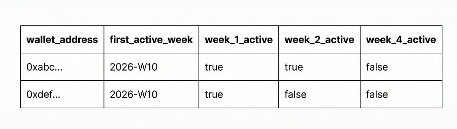
A healthy pattern shows a drop after week one, that’s normal, most products lose casual first-time users, that flattens into a stable retained base. An unhealthy pattern shows a near-total cliff to zero, which usually means the cohort was mostly incentive-driven and had no reason to return once the reward stopped.
2. Real TVL vs. inflated TVL
The resources question.
What it actually measures: genuine, distinct economic capital committed to a protocol, not the number a dashboard reports before anyone checks it.
Total value locked sounds like a simple sum of deposited assets, and in principle it is. In practice, TVL is one of the easiest metrics in crypto to inflate, because of how composable DeFi is.
The most common inflation mechanism is recursive looping: ☞ a user deposits an asset, ☞ borrows against it, and ☞ redeposits the borrowed amount, sometimes multiple times. Each loop adds to the reported TVL figure even though the same underlying capital is just being counted repeatedly.
A second common mechanism is self-referential liquidity, where a protocol’s own token is paired against itself or against a wrapped version of itself in a liquidity pool, inflating a headline number without representing any external capital at all.
To check whether a TVL figure is real, look for three things: ✔ what percentage of it is denominated in the protocol’s own governance token (a high percentage is a red flag), ✔ whether the figure holds steady across a full incentive cycle rather than spiking during reward periods and draining right after, and ✔ whether the underlying positions show signs of looping, the same wallets appearing as both depositors and borrowers of the same asset, repeatedly, in tight succession.
Aggregators like DefiLlama report the number a protocol’s contracts show, auditing whether that number represents distinct capital was never their job. It’s still the analyst’s.
3. Revenue quality
The revenue question.
What it actually measures: whether the money flowing through a protocol represents sustainable economic activity, or activity that only exists because it’s being paid for.
“Revenue” in crypto gets used loosely. Gross fees paid by users are not the same thing as protocol-retained revenue, and neither is the same thing as net revenue after subtracting what the protocol pays out in token incentives to generate that activity in the first place.
A protocol can report meaningful weekly fee revenue while simultaneously distributing more in token rewards than it collected, meaning the activity is being subsidized into existence rather than occurring organically.
Quality has two dimensions worth checking separately.
First, concentration: is the revenue spread across a genuinely broad user base and range of activity, or does it come predominantly from one or two large actors whose behavior could stop at any time?
Second, correlation with incentives: does revenue hold steady when token emissions decrease, or does it fall in lockstep?
Revenue that only exists alongside active token subsidies isn’t revenue in any durable sense. It’s a temporary transfer from the incentive budget dressed up as organic usage.
Platforms like Token Terminal standardize how protocol revenue gets reported across the industry, which is genuinely useful, but standardized reporting still can’t tell you whether that revenue would survive the subsidy being switched off. That judgment call is still yours.
4. Capital efficiency
The resources question, from a different angle.
What it actually measures: how much real economic activity a protocol generates for every dollar of capital sitting inside it.
A large TVL figure is often treated as an unambiguous positive, but capital sitting idle isn’t doing much for anyone except collecting a token reward. The useful lens is a ratio, not an absolute number: fees or volume generated over a period, divided by the average capital locked over that same period.
capital_efficiency = fees_generated_over_period / average_tvl_over_period
A protocol with $500M in TVL generating a modest amount in weekly fees is capital-inefficient, the capital is parked for yield-farming purposes rather than actually being used.
A protocol a fraction of that size generating comparable fee revenue is doing dramatically more with less, and is usually the more durable business, even though its headline TVL number looks less impressive on a leaderboard.
5. Sybil ratio
The risk question.
What it actually measures: what percentage of “unique” wallets interacting with a protocol are actually controlled by the same real person or entity, splitting activity across multiple addresses to farm rewards.
This is the metric that quietly distorts almost every other number on this list. Sybil wallets inflate user counts, they inflate TVL through wash-style deposits across coordinated addresses, and they vanish the instant whatever they were farming ends, which is exactly what shows up as a retention cliff in the sticky-users analysis above.
Detecting sybil activity is a pattern-recognition problem, not a single query.
The signals analysts look for include: many wallets funded from a single source address within a tight time window, near-identical transaction timing and sizing across otherwise unrelated addresses, and minimum-effort behavior, wallets that do exactly enough to qualify for a reward and nothing more. None of these signals alone is proof.
Together, and at scale, they’re usually decisive.
The practical takeaway: treat any headline user or TVL number as an upper bound, not a fact, until it’s been sanity-checked against obvious sybil clustering.
6. Retention cohorts by wallet age
The retention question, at higher resolution.
What it actually measures: whether a protocol is retaining genuine users, viewed through a sharper lens than ordinary retention, segmenting by how old each wallet was, on-chain, before it ever touched the protocol.
This is the least commonly used metric on this list, and arguably the most revealing one. Ordinary retention cohorts group users by when they first showed up. Wallet-age cohorts group them by how much on-chain history they already had at that point.
A wallet created the same day it first interacted with a protocol behaves very differently, on average, from a wallet with two years of prior on-chain activity behind it. Brand-new wallets with no history disproportionately correlate with farming behavior, they were created specifically for the opportunity in front of them.
Older wallets with an established on-chain footprint choosing to engage are a meaningfully stronger signal of real product interest.
Building this view means bucketing every wallet, at the moment of its first interaction with a protocol, by the age of that wallet on-chain (under 7 days old, 7 to 90 days, 90 days to a year, over a year), and then running the same retention curve from the sticky-users section separately within each bucket.
Retention that looks strong in aggregate but is being carried entirely by the “under 7 days old” bucket isn’t a healthy product. It’s an incentive program with good marketing.
Part Four: Putting It Together
Before trusting any headline metric a protocol publishes, run it through this sequence:
- Check retention, not raw activity. A cohort that vanishes after the incentive ends tells you more than any single active-user count.
- Check what TVL is made of. Own-token concentration, looping patterns, and stability across a full incentive cycle reveal whether the number is real capital or recycled capital.
- Check whether revenue survives without subsidy. If fee revenue and token emissions move together, the activity is being subsidized, not earned.
- Check capital efficiency, not just capital size. A smaller protocol doing more with less capital is usually the better bet, even if it looks smaller on a leaderboard.
- Check for sybil clustering before trusting any user or wallet count. Assume some inflation exists until the signals have actually been checked.
- Segment retention by wallet age. This is the fastest way to tell an incentivized farming wave from genuine product-market fit.
None of these checks require insider access. Every input is public, on-chain data. What separates an analyst from a dashboard reader is the discipline of running through this sequence instead of stopping at the first number that loads on the screen.
Conclusion
This is the actual skill underneath everything else in on-chain analysis: not which tool you query with, but whether you can tell which numbers deserve trust and which ones need to be taken apart first.
The life cycle, from raw ledger to labeled data to aggregate metric to interpreted decision, is the same for every protocol worth looking at. Once that path can be walked in both directions, reading a dashboard number forward and tracing a suspicious one backward, on-chain data stops being something you read. It becomes something you analyze.
A model can write the query behind any of this in seconds. What it still can’t do is everything this piece just walked through.
I remain Zayd, the bass-ass content writer and your On-chain data analyst.