Silver price rallied this month from below $60 per ounce to over $66 , alongside gold’s strong recovery. The metal has been on a tear, breaking out of its multi-month consolidation and testin
Silver price rallied this month from below $60 per ounce to over $66 , alongside gold’s strong recovery. The metal has been on a tear, breaking out of its multi-month consolidation and testing key resistance levels.
However, silver faced resistance near $66 and is now trading around $64 at press time. The pullback is modest, but the broader trend remains bullish.
One analyst, Northstar, weighed in on the silver versus Bitcoin situation with a dramatic warning:
“I’m not sure if everyone is aware just how close we are to Bitcoin confirming that it will lose to silver for many years to come.”
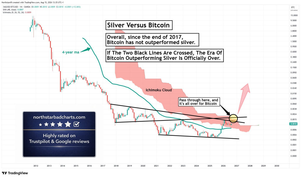
The chart he shared shows the silver/Bitcoin ratio (XAGUSD divided by BTCUSD) on a monthly timeframe. When the ratio rises, silver is outperforming Bitcoin. When it falls, Bitcoin is outperforming silver.
The Chart: A Decade-Long Compression
The key to reading this chart is understanding that it is not a Bitcoin price chart or a silver price chart in isolation. It is the relative performance of the two assets.
The long-term trend has overwhelmingly favored Bitcoin. From roughly 2011 through the mid-2020s, the XAG/BTC ratio collapsed by orders of magnitude. That reflects Bitcoin appreciating much faster than silver over the full period.
But that trend is now being challenged.
The chart author notes that “since the end of 2017, Bitcoin has not outperformed silver.” What that means is that after the enormous collapse in the ratio into late 2017, the ratio has broadly stopped making the kind of sustained, dramatic downward progress seen earlier. Bitcoin has certainly had periods of large gains against silver since then, but on this particular long-horizon ratio chart, the secular decline has become much less decisive.
 Source: X/@NorthstarCharts
2017/2018 appears to mark a structural change. Before that point, XAG/BTC was essentially in a persistent collapse. Afterward, the market begins behaving more like a long-term consolidation. Instead of an uninterrupted decline, the ratio oscillates through a broad multi-year structure.
The Convergence Zone: Multiple Barriers Align
The monthly timeframe makes the current setup more significant than a daily technical breakout. A break of a trendline on this timeframe would be interpreted as a potential change in a multi-year trend.
There are two prominent black trendlines converging around 2026:
- The upper black line slopes downward from approximately 2017/18 and acts as long-term resistance. It connects successive areas where silver’s relative strength against Bitcoin failed to continue.
- The second line rises gradually from around 2018 and converges with the descending resistance.
Together they compress the ratio into an increasingly narrow range. The decisive level looks to be around the 0.0015–0.0020 region of the XAG/BTC ratio. A sustained monthly move through that zone would be more meaningful than a brief intramonth spike.
The upper descending black trendline is arguably the most important line on the chart. It represents the boundary of Bitcoin’s remaining long-term relative-strength structure against silver. Breaking it would mean silver has achieved something it has been unable to do for most of the post-2017 period.
Read also: Silver Price Prediction: One Level Stands Between Here and Much Higher
The 48-Month Moving Average and Ichimoku Cloud
The 48-month moving average (teal line) adds another layer to the setup. Historically, the ratio spent long stretches underneath this moving average during Bitcoin’s major period of outperformance. The current ratio has recovered toward and through that long-term average, suggesting relative momentum is changing.
Using a four-year moving average is particularly interesting in a Bitcoin comparison. Forty-eight months roughly corresponds to Bitcoin’s halving-cycle length. The shape of that moving average has changed materially. During Bitcoin’s strongest period of relative outperformance, the 48-month average plunged steeply. By the mid-2020s, it has flattened considerably. A flattening long-term moving average means the relentless deterioration in silver’s relative value has slowed.
The Ichimoku cloud is another major obstacle. The red shaded region represents the monthly Ichimoku cloud. For much of the chart, the ratio has remained beneath or inside a bearish cloud structure. Moving through it and establishing price above it would represent a much more consequential change in trend conditions.
Several long-term technical barriers are clustering together at roughly the same time. This is not just one trendline being tested. Around 2026, the ratio is interacting with the long-term descending resistance, another black structural line, the 48-month moving-average area, and the Ichimoku cloud. The cloud also appears to become much thinner toward 2026–2027, suggesting there is less overhead technical resistance than there was several years ago.
What Would Constitute Confirmation
Touching or briefly crossing the black line is not enough. This is a monthly chart, so confirmation should ideally happen on that same timeframe.
A stronger signal would involve:
- A monthly close above the descending black resistance
- A move above the relevant portion of the Ichimoku cloud
- Follow-through in subsequent months
- The former resistance subsequently holding as support
The most convincing sequence would be:Breakout → monthly close above resistance → follow-through → retest that holds → rising 48-month moving average.
My Take: A Major Regime Change in Sight
The chart is dramatic precisely because price is approaching an extraordinary confluence of resistance. The ratio has not decisively broken out yet. Right now, the chart arguably says: “Silver is closer than it has been in years to invalidating Bitcoin’s long-term relative-performance structure.” It does not yet say: “Silver has already invalidated it.”
But if XAG/BTC decisively clears the descending resistance and cloud, technicians would suddenly have much less historical resistance immediately overhead. That is the basis for the chart’s large upward arrow.
The phrase “Bitcoin’s outperformance era may be about to end” needs a precise definition. The strongest defensible formulation is not that Bitcoin will necessarily perform badly. It is that a confirmed breakout would challenge the long-term trend of Bitcoin outperforming silver.
A secular reversal in this ratio could be interpreted as more than “silver had a good year.” It could suggest that hard-asset and commodity scarcity is beginning to outperform digital scarcity at the margin. That would be a much larger market regime change.
And it could happen without investors abandoning Bitcoin. The relevant question would simply change from “Will Bitcoin rise?” to “Which scarce asset rises faster from here?”
For now, silver price is approaching the most important relative-performance test of the decade.
Subscribe to our YouTube channel for daily crypto updates, market insights, and expert analysis.
The post Silver Price Warning: Bitcoin’s Outperformance Era May Be About to End appeared first on CaptainAltcoin.