

Google unveils new gradient logo marking its biggest design shift since 2015
 LGC
LGC
 GEMINI
 GEMINI
 WHEN
WHEN
 SN56
SN56
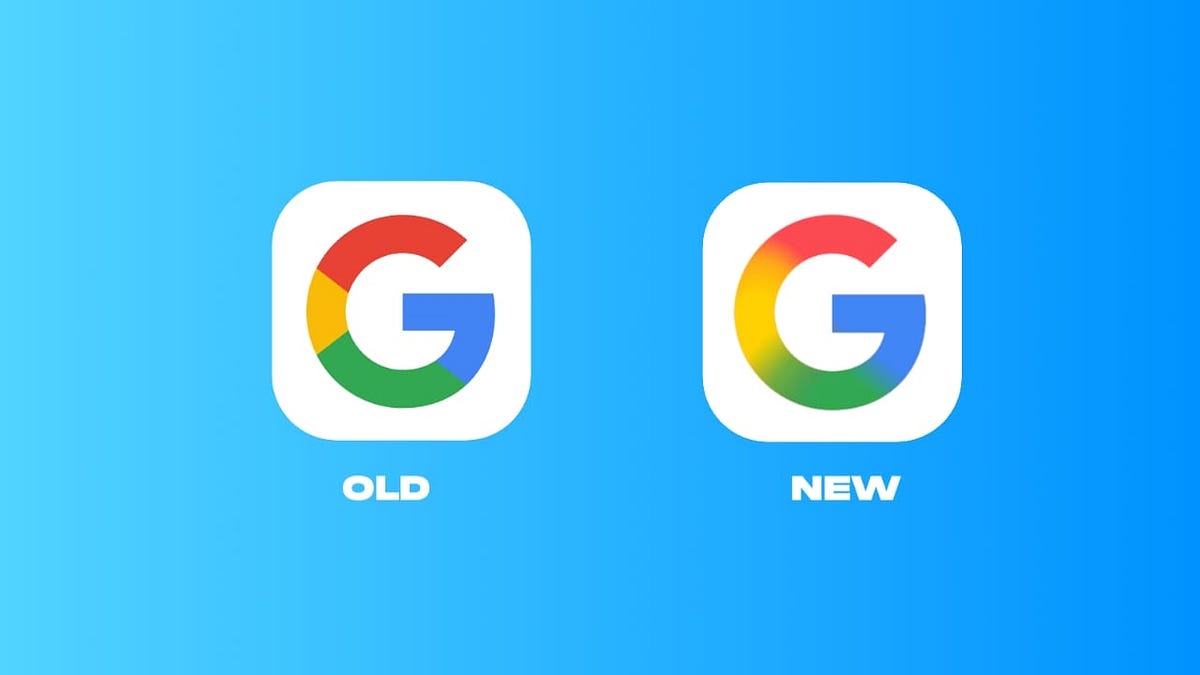
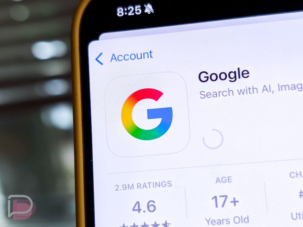
Google has released a new company logo, marking its first major redesign in a decade. The new design makes the familiar “G” appear more radiant with a gradient colour scheme that seamlessly blends its four colours into a single, flowing transition.
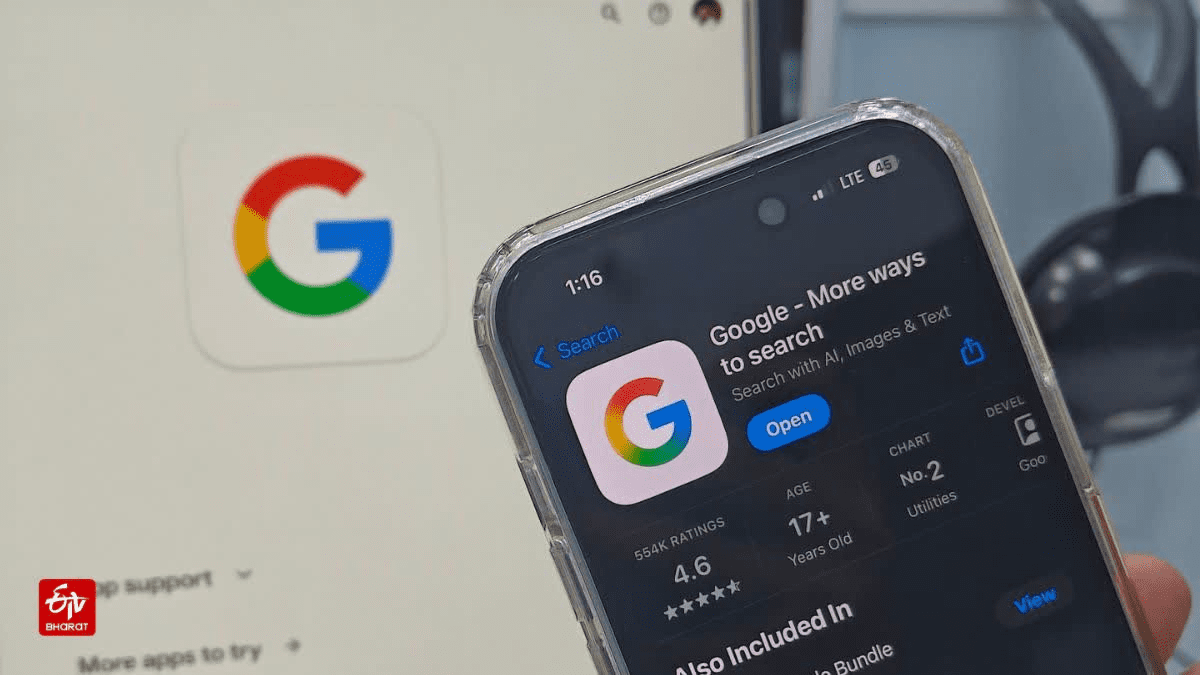
A series of tests began earlier this year, when the new logo was introduced to a limited number of users on both Android and iOS. Google claims that this updated look will soon be available across all its platforms. The refresh isn’t limited to just the “G” icon; Google has also subtly updated the Google Home logo to align with the new design.
Users will soon notice a fresh look across Gmail, Drive, Meet, Calendar, and other Google products. This marks the first significant update to Google’s main identity since 2015, when the company introduced the multicoloured “G” logo consisting of four distinct segments. This fragmented design has now been replaced by a single gradient, aligning Google’s visual identity with its Gemini AI brand.
A decade of visuals ends for Google
Google’s previous logo was in use for an entire decade, making it one of the longest-lasting designs in the company’s history. Introduced in 2015, the logo reflected the clean and simple style that the company aimed for at that time. This change was part of an effort to create a more digital-friendly appearance, transitioning to the multicoloured “G.” Over the years, Google has made subtle modifications to its logos.
These redesigns were often carried out to enhance readability across different screen sizes or to align with current design trends. The icons for apps like Gmail, Drive, and Photos were updated periodically, but the main logo remained consistent. This consistency allowed the company to establish a strong and recognisable brand presence across billions of devices.
The new update breaks that decade of continuity. By adopting the gradient, Google is unifying its visual language. Smoother colour transitions in the new appearance make it more appropriate across devices. Gradients appear well on high-resolution screens and in dark mode, now the norm on smartphones and laptops.
The design now resembles that of Google’s other services and products more closely. Gemini, Google’s artificial intelligence platform, already features a gradient colour logo, and this shift helps to align the broader Google brand with that aesthetic.
As a result, users will experience a more cohesive visual look when transitioning between different services, such as search, productivity software, and AI-related offerings. The rollout of these changes will occur in phases.
Read also: Google Chrome: New vulnerabilities and how to protect yourself
Some consumers may notice the new logo on a single product before others do. Additionally, certain apps and websites might display both the old and new logos side by side for a limited time. A staged rollout is typical for Google, as it allows the company to test updates and resolve issues before a large-scale global launch.
Rollout to all Google services
The redesign will only affect the visual appearance of Google’s services and will not change how they operate. Google has stated that there will be no impact on performance, features, or functionality. The new gradient logo will be displayed across all of Google’s platforms, including core services, third-party integrations, and even hardware.
Google Nest products and Google Home speakers will receive software updates to showcase the new branding. This updated look will also be reflected in mobile app icons, browser tabs, and sign-in pages. Workspace users will begin noticing these changes across their productivity apps. Google has indicated that the transition will take a few months to complete.
For most users, this will be the most noticeable brand change from Google in years. The company has not undergone a complete visual overhaul since the introduction of the current logo family in 2015.
It maintains colour consistency across different screens, enabling Google to easily achieve uniformity across devices and systems. This also facilitates simpler integration in future products.
As Google consistently introduces new devices and services, the clean gradient “G” will serve as a cohesive identity that unifies its ecosystem. According to Google, users can expect to see the updated logos across all services at some point this year. The company will continue updating its websites and apps until the process is complete.